A alternative tab-less browser design
An attempt at designing an alternative browser UI that does not rely on current metaphors such as tabs, history, back/forward buttons, address bars and bookmarks.
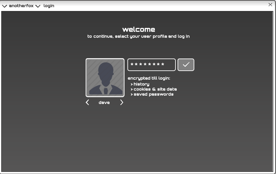
Login
This scheme considers the web to be an ecosystem separate from the operating system and therefore requires its own authentication. All user profile data is encrypted on disk – history, cookies, local storage, saved passwords and user settings. This allows the user to save website passwords and permit authentication cookies more liberally (because his profile password now acts as a gateway between other users and saved data). After logging in, a typical session will not require the user to enter passwords at all (except for new website registrations).
Search/address bar
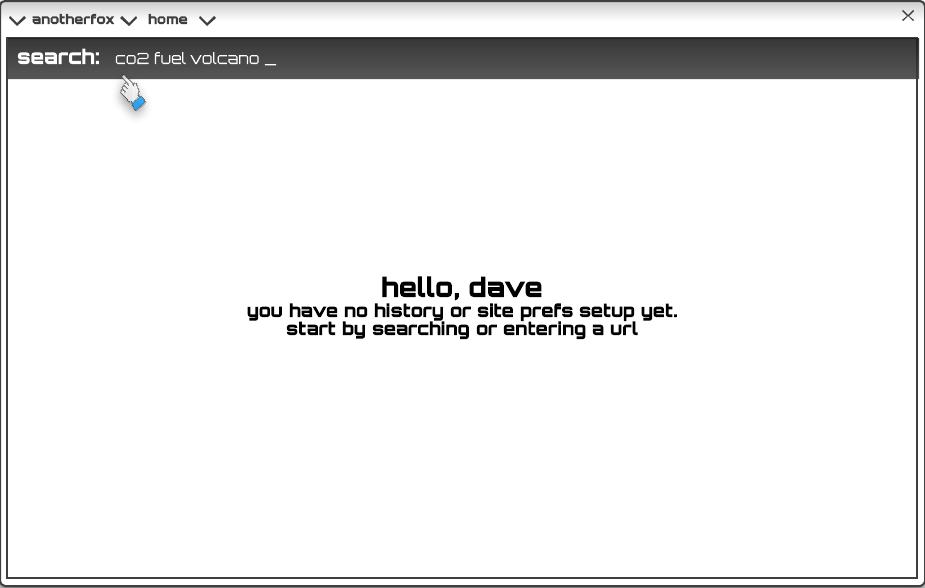
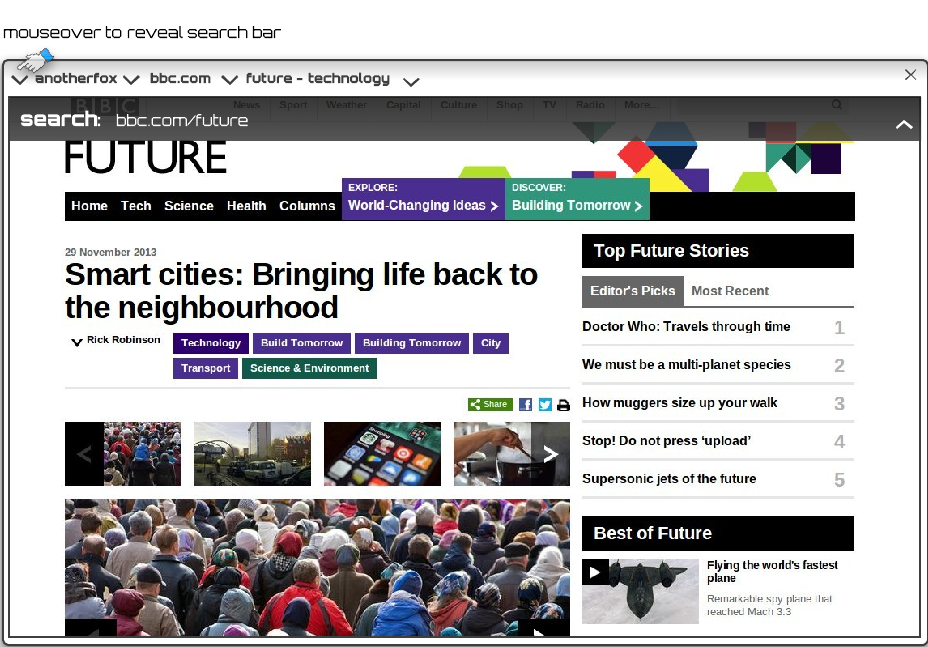
No attempt is made to improve on the functionality of the modern address/search bar, except that it will only be visible on demand. The bar will slide ‘underneath’ the title bar when not in use.
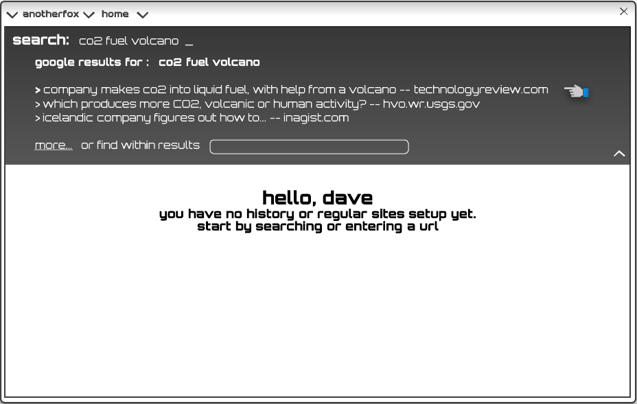
Search as a service
If search providers are willing to provide search as a service, it may be possible to render search results as a part of the UI rather than as content. It may also be possible to filter results based on metadata provided by the service. If such a service is not available (and it is unlikely to be), search results will be loaded into the browser like any other web page.
Basic UI
The UI exhibits a number of departures from standard design. An address bar is not displayed (but the search bar and/or the current URL can be displayed on demand). The current domain name and the current page title is always displayed in the window title bar. There are no tabs or back/forward buttons. These are replaced by elements explained below.

Navigation
The search/address bar (or the “omnibar”) is revealed on a mouseover trigger. As with most modern browsers, URLs will be treated as such, while other strings will trigger the search function. The omnibar slides underneath the title bar after use. This latter behavior is common to most of the other semi-transparent UI overlays explained below.
Alternative to tabs
The “tab” metaphor was a response to the lack of a proper UI representation of open pages in early browsers. While this may be an appropriate representation, the very idea of an “open” page or document may not be. The open page metaphor serves several purposes:
-
Give the user a sense of proximity to pages that he plans to return to within the current session.
-
Maintain a state for each page — input field changes, scroll position, session data etc. — so that the user will not have to reinitialize a page every time it is visited.
-
Manage resources — maintaining a state for a page even when a user navigates away from it (or moves focus) also helps resource utilization. It makes no sense to re-retrieve a page over the network and completely re-render it each time the user views it. The pages (or tabs) the user chooses to keep open depend on these considerations too.
It makes sense to relieve the user of the resource management decisions if possible. Imagine that instead of tabs, there is a list of “recent” (or frequent) visits (not unlike a history). When the user navigates away from a page or switches to another page, the browser determines whether to keep it open or to close it (or perhaps even “hibernate” it). The less frequently a page is “touched” by the user, the more likely it will be unloaded. The user will be able to override this for selected sites if he choses to do so. Whenever he does not, tabs and open documents will no longer serve as means of manually managing resources.
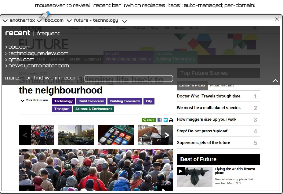
Displaying a recently accessed list of domains is likely to be enough to give the user a sense of proximity. However the visual design may have to be tweak so that it will be no less convenient than tabs, but without cluttering the toolbar area.
Clicking entries in the recent list will allow the user to switch between different sites and pages without ever having to actually “close” anything. The closing will be handled by the browser based on inactivity. The distinction of an “open” or “closed” tab (or page) will cease to exist for the most part.
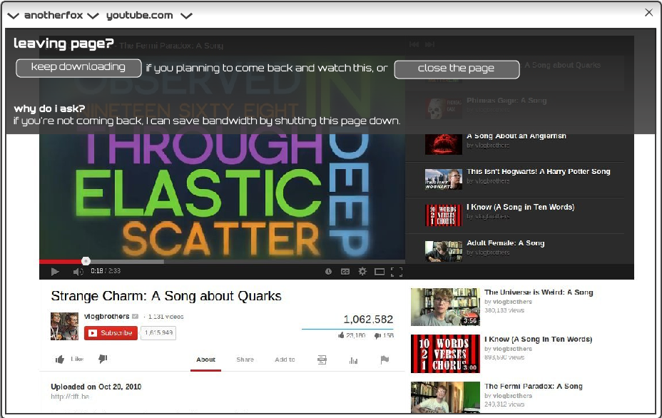
On some occasions, it may not be possible for the browser to determine on its own whether the user is abandoning a page or planning to revisit it. Favoring the latter is usually best, except when the page may be resource intensive (ongoing multimedia stream, running Javascript). In such cases, the browser may have to heuristically prompt the user for an answer.
Bookmarks vs. site preferences
This design recognizes two types of web usage: a) the traditional “browsing” where the user follows a series of hyperlinks and b) regularly used web sites and apps. Most pages encountered during traditional browsing require no special treatment and can be forgotten after a period. The other type requires special treatment. All traditional browsers have to offer for this is the “bookmark” feature.
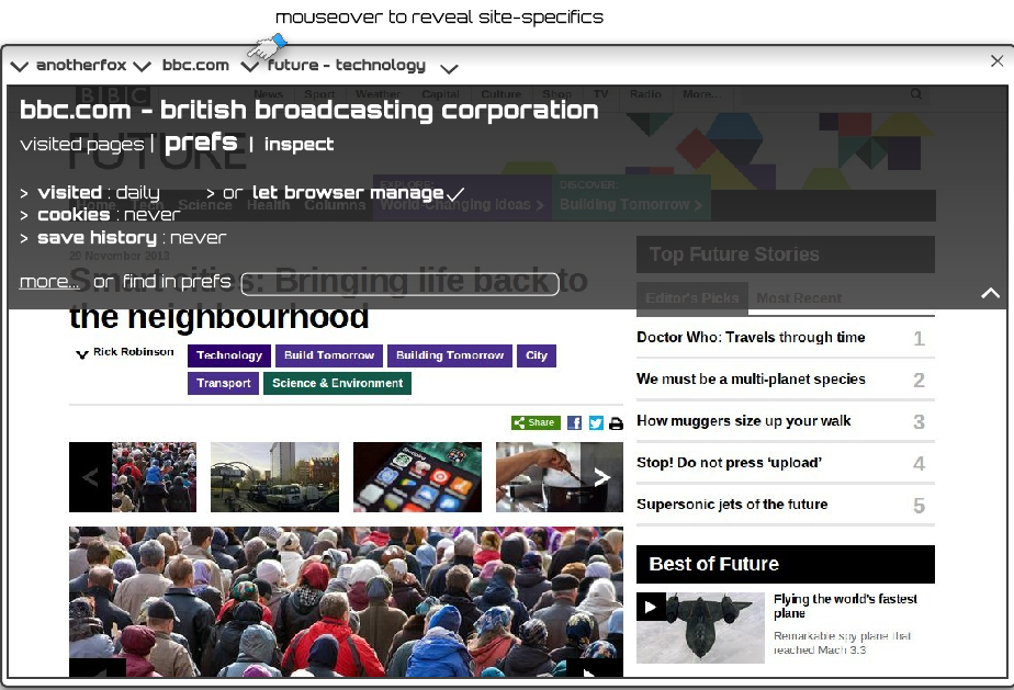
This design allows the user to configure a number of preferences for frequently visited sites and web apps. For example:
-
Setting a visit frequency will allow the browser to optimally load and unload the site. Possible values may include: rarely, occasionally, daily, several times a day, keep open always (which is the same as the “pin tab” feature in some browsers).
-
The browser may be able to configure this on its own, based on the users past visit patterns.
-
This config will also help the browser display the page list that acts as the alternative to tabs in this design.
-
For some web apps, storing a history may not make sense. History may be disabled for such sites.
Extensions
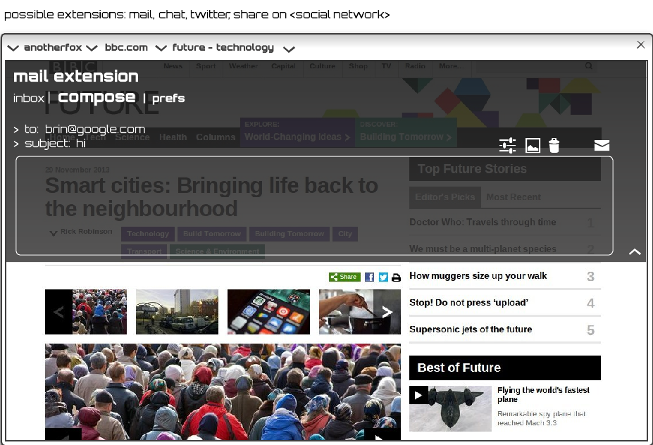
There are several types of actions that the modern web user needs to perform multiple times a day. These are actions that do not warrant keeping a full page loaded in case it is needed. At the same time, these are the type of action that would make the user impatient if the UI takes too much time to load. These actions include:
- Chat
- Microblogging (such as twitter)
- Social networking (mainly sharing)
These are good candidates for in-browser extensions that allow the user to perform quick actions without having to navigate away from the current page.
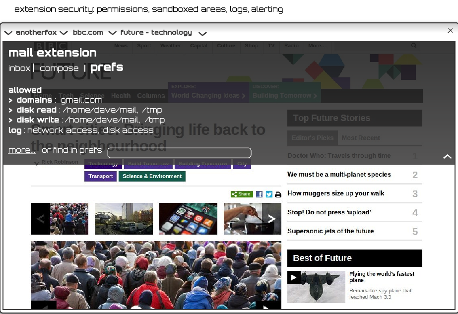
Paranoia mode
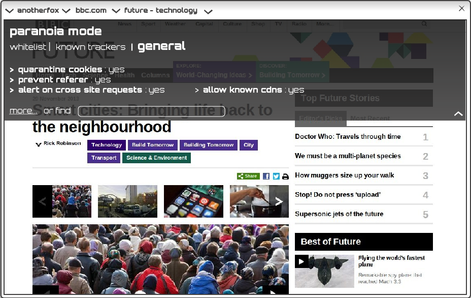
Paranoia mode is somewhat different from “incognito” mode in that it limits certain types of interactions between the browser and websites that can potentially compromise user privacy and security, with the understanding that it might break certain website features. For example, a cookie from a social network may be “quarantined” so that the browser will shield the cookie from access whenever the user is browsing other sites.
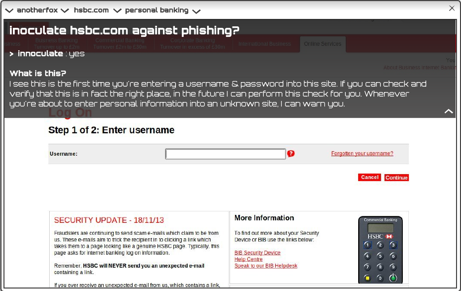
Other security features are possible, such as performing additional checks and/or warning the user when pages appear to be authentication related (contains username, email and password fields) or suspicious (page title contains a known site name but the domain name does not match, domain name is a slight variation on a domain the user has marked as high security, user has entered personal information into input fields).
More ambitious features
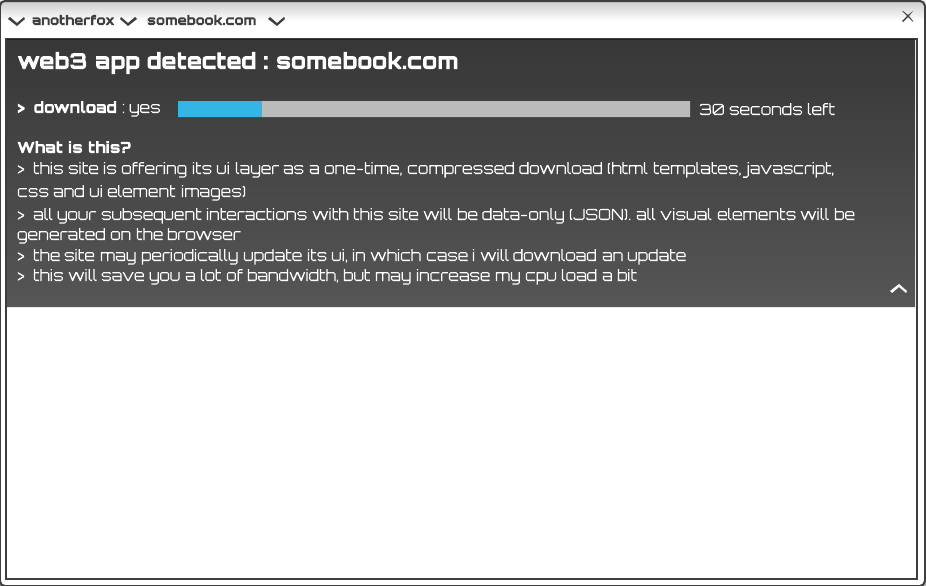
“Web 3.0″ mode for supported web apps
Reading mode
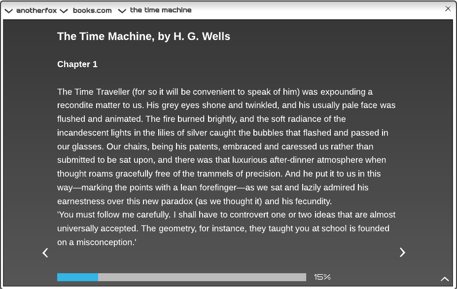
The browser will attempt to isolate and display sections of the DOM it can identify as main content. Alternatively, the user may manually select a section to be rendered for distraction-free reading.
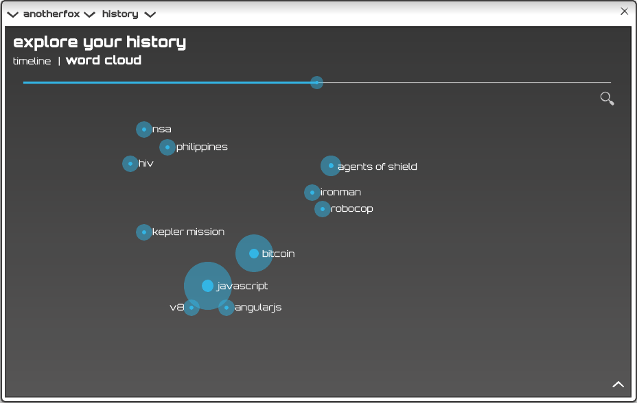
History
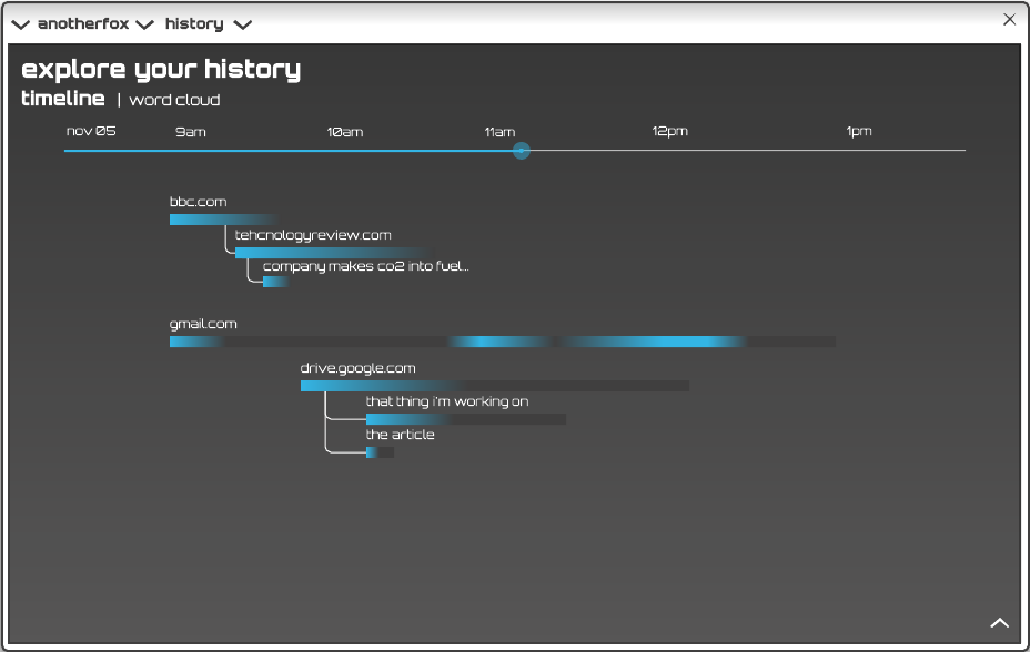
In addition to being a place for revisiting past URLs, history can also provide the user with a measure of analytics. It can show how he has spent his time and also the types of content that he appears to be most interested in. This latter information in particular may be used by the browser to act as an agent and locate interesting content for the user.
